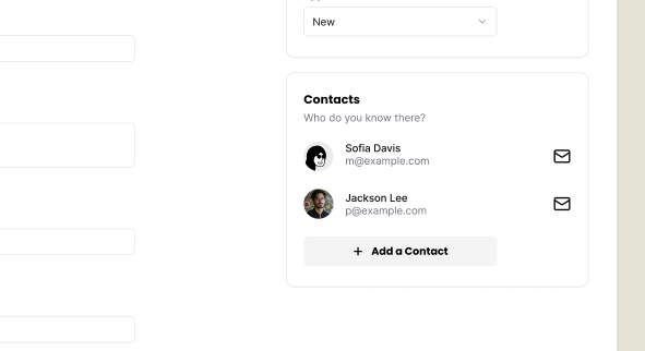
Contacts
Things are coming together nicely. But we still have hard-coded contacts into the Job Application form. Let's make this dynamic.
If we look at the Figma file, you'll notice that we have an "Add a Contact" button on our sidebar:
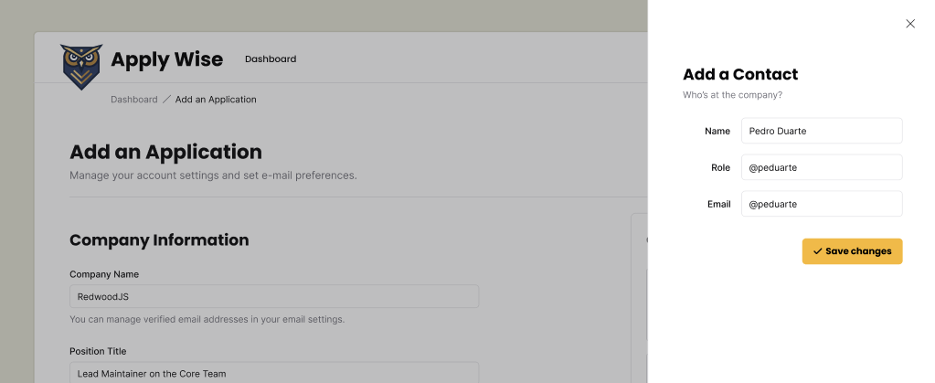
When the user clicks on this button, we want to open a side panel that contains the contact form:
Adding a Contact
Let's start with building the UI and then we will persist the data in the database.
Adding a step to test for Contacts
Let's add the selectors we'll need.
buttonAddContact: ["button", { name: "Add a contact" }],
formContactForm: ["form", { name: "Add a Contact" }],
inputFirstName: ["textbox", { name: "First Name" }],
inputLastName: ["textbox", { name: "Last Name" }],
inputRole: ["textbox", { name: "Role" }],
inputEmail: ["textbox", { name: "Email" }],
buttonCreateContact: ["button", { name: "Create a Contact" }],
Let's add the steps to our "How to add a new Job Application" test case:
await test.step(`#### Add a Contact for the Application
Open the Add a Contact sheet by clicking the "Add a contact" button.`, async () => {
const addContactButton = page.getByRole(
...selectors.buttonAddContact,
)
await screenshot(testInfo, addContactButton, {
annotation: {
text: "Click here to add a contact to this application",
},
})
await addContactButton.click()
})
await test.step(`Enter the contact’s information:
- First name
- Last name
- Role in the company
- Email
`, async () => {
const firstNameInput = page.getByRole(...selectors.inputFirstName)
const lastNameInput = page.getByRole(...selectors.inputLastName)
const roleInput = page.getByRole(...selectors.inputRole)
const emailInput = page.getByRole(...selectors.inputEmail)
await screenshot(
testInfo,
page.getByRole(...selectors.formContactForm),
)
await firstNameInput.fill("John")
await lastNameInput.fill("Doe")
await roleInput.fill("HR Manager")
})
This is good enough to get started. We'll add the submission logic and assert that we added a contact once we have these two steps passing.
Implementing the side drawer
Again, we'll use our shadcn/ui components.
This time, we're going to reach for the Sheet component.
You can copy the boilerplate code from the shadcn/ui docs and paste it at the top of our ApplicationForm component:
import {
Sheet,
SheetContent,
SheetDescription,
SheetHeader,
SheetTitle,
SheetTrigger,
} from "./ui/sheet"
...
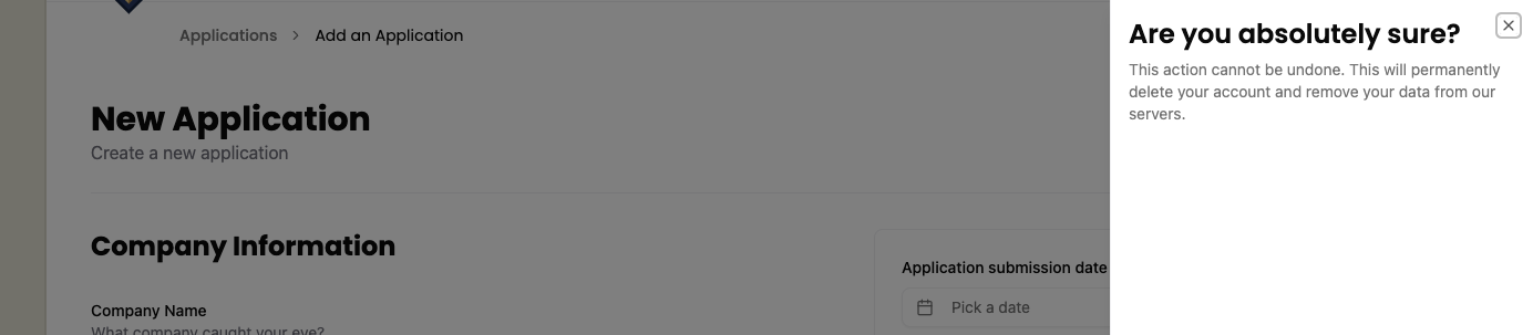
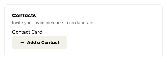
<div className="box">
<h3>Contacts</h3>
<p className="input-description">
Invite your team members to collaborate.
</p>
<div>Contact Card</div>
<Sheet>
<SheetTrigger>Open</SheetTrigger>
<SheetContent>
<SheetHeader>
<SheetTitle>Are you absolutely sure?</SheetTitle>
<SheetDescription>
This action cannot be undone. This will permanently delete
your account and remove your data from our servers.
</SheetDescription>
</SheetHeader>
</SheetContent>
</Sheet>
</div>
If you take a look at this within the browser, you should see the "Open" trigger:

If you click on the trigger, the sheet should slide open:
Now, let's replace the placeholder content with the real stuff.
You may have noticed that the Sheet code contains a trigger (SheetTrigger) and SheetContent. Inside the content, there's a SheetHeader with a SheetTitle and SheetDescription.
First, let's adjust the SheetTrigger:
import { Icon } from "./Icon"
...
<SheetTrigger className="flex items-center gap-2 font-poppins text-sm font-bold bg-secondary py-3 px-6 rounded-md cursor-pointer">
  <Icon id="plus" size={16} />
  Add a Contact
</SheetTrigger>
Details
- We added an
Iconcomponent and gave it anidofplusand a size of16. - We changed the text to
Add a Contact. - We can add some styling to the
SheetTriggerto make it look like a button.flex items-center gap-2will align the icon and text next to each other, putting8pxof space between them.font-poppins font-bold text-smwill use the font-familyPoppins, make it bold, and set the font size to14px.bg-secondarywill make the background a beige color (defined in our@theme)py-3 px-6will add12pxof padding to the top and bottom, and24pxof padding to the left and right.rounded-mdwill round the corners of the button.cursor-pointerwill change the cursor to a pointer when hovering over the button.
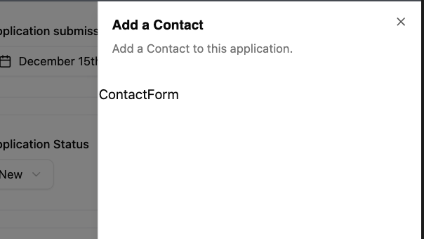
Much better! Now, for our SheetContent:
<SheetContent  className="pt-[100px] px-12">
  <SheetHeader>
    <SheetTitle>Add a Contact</SheetTitle>
    <SheetDescription>
      Add a Contact to this application.
    </SheetDescription>
  </SheetHeader>
</SheetContent>
Details
- Change the
SheetTitletoAdd a Contact. - Change the
SheetDescriptiontoAdd a Contact to this application. - We added some styling to the
SheetContentto give our content some additional space.100pxof padding to the top and48pxof padding to the left and right.
Although I've been preaching about YAGNI, but ApplicationForm is doing a lot right now. We'll compartmentalize the contact creation into its own component. This way we're not mixing up the contact creation logic with the Application creation logic and making it a bit easier for the next developer to understand and maintain this.
So let's make a ContactForm form component at src/app/components/ContactForm.tsx.
export const ContactForm = () => {
  return <div>ContactForm</div>;
}
Let's add this to our ApplicationForm to make sure we're setting everything up correctly.
import { ContactForm } from "./ContactForm"
...
<SheetContent className="pt-[100px] px-12">
  <SheetHeader>
    <SheetTitle>Add a Contact</SheetTitle>
    <SheetDescription>
      Add a Contact to this application.
    </SheetDescription>
  </SheetHeader>
  <ContactForm />
</SheetContent>
You should see something similar to this:
Now let's replace our <div> with our form. It should contain fields for:
- first name
- last name
- role
import { Icon } from "./Icon"
import { Button } from "./ui/button"

export const ContactForm = () => {
  return (
    <form
      aria-labelledby="add-contact-title"
      aria-describedby="add-contact-description"
    >
      <div className="field">
        <label htmlFor="firstName">First Name</label>
        <input type="text" id="firstName" name="firstName" required />
      </div>
      <div className="field">
        <label htmlFor="lastName">Last Name</label>
        <input type="text" id="lastName" name="lastName" required />
      </div>
      <div className="field">
        <label htmlFor="role">Role</label>
        <input type="text" id="role" name="role" required />
      </div>
      <div className="field">
        <label htmlFor="email">Email</label>
        <input type="email" id="email" name="email" required />
      </div>
      <div className="field">
        <Button>
          <Icon id="check" size={24} />
          Create a Contact
        </Button>
      </div>
    </form>
  )
}
Details
- This form should be pretty straightforward. It's mostly vanilla HTML. I wrapped each
labelandinputpairing with adivthat has a class offield. Conveniently, we've already defined these styles within ourstyles.cssfile. - At the bottom of the form, I'm using a shadcn/ui
Buttoncomponent, similar to what we've done before. I have a checkIconinside with the text "Create a Contact". - I've also made every field required, using the HTML
requiredattribute. - We also gave the form two
aria-attributes,labelledbyanddescribedby.
We need to go back to the ApplicationForm to give the SheetTitle and SheetDescription id attributes so we can target them to make our form a bit more accessible.
<SheetTitle id="add-contact-title">Add a Contact</SheetTitle>
<SheetDescription id="add-contact-description">
Now our new steps are passing, but the test is failing because we didn't submit the form and dismiss the side sheet.
Testing form submission
So, let's see if we can submit the form and see if we get a new contact. First we'll add a few new selectors, one to test that we're displaying the list of contacts, and the other to test that the correct contact is being displayed.
listContacts: ["list", { name: "Contacts" }],
headingTestingContact: ["heading", { name: "John Doe" }],
await test.step('Add the contact by clicking the "Create a Contact" button', async () => {
  const createButton = page.getByRole(
    ...selectors.buttonCreateContact,
  )
  await screenshot(testInfo, createButton, {
    annotation: {
      text: "Click here to create the contact",
      position: "left",
    },
  })
  await createButton.click()
})

await test.step("Your new contact appears in the Contacts section", async () => {
  const contactCards = page.getByRole(
    ...selectors.listContacts,
  )
  await expect(
    page.getByRole(...selectors.headingTestingContact),
  ).toBeVisible()
  await screenshot(testInfo, contactCards, {
    annotation: {
      text: "Your new contact appears here in the Contacts section",
      position: "left",
    },
  })
})
Details
- We have 2 steps.
- Click the submit button.
- Assert that our new contact has been added.
- We also want to take a screenshot to document that the location where the contacts render.
Error: expect(locator).toBeVisible() failed

Locator: getByRole('heading', { name: 'John Doe' })
Expected: visible
Timeout: 5000ms
Error: element(s) not found
And now our test is failing to find the new contact. So let's see about implementing that.
Implementing form submission
So if you recall from the last tutorial I mentioned some hypothetical alternative ways to get the ApplicationStatuses from the DB in case we needed to make the ApplicationForm a client component.
Turns out we're going to need to make some React state to hold the contacts until we're ready to submit. So, we're going to turn the ApplicationForm into a client component, as React state management is only available for client components.
First we'll move the DB call to the New.tsx component and add a prop to pass the applicationStatusesQuery to our form.
-"use server"
+"use client"
...
-import { db } from "@/db/db"
+interface ApplicationFormProps {
+  applicationStatusesQuery: {
+    id: number
+    status: string
+  }[]
+}

-export const ApplicationForm = async () => {
-  const applicationStatusesQuery = await db
-    .selectFrom("applicationStatuses")
-    .selectAll()
-    .execute()
+export const ApplicationForm = ({
+  applicationStatusesQuery,
+}: ApplicationFormProps) => {
Now let's add the database query here and pass the statuses to the form.
import { db } from "@/db/db"

export const New = async () => {
  const applicationStatusesQuery = await db
    .selectFrom("applicationStatuses")
    .selectAll()
    .execute()
  return (
    ...
          </div>
      <ApplicationForm applicationStatusesQuery={applicationStatusesQuery} />
    </>
  )
}
Now with this refactor, we're at feature parity and can start to add the state management to handle contacts.
import { useState } from "react"
import { Contact } from "@/db/db"
...
type ContactFormData = Omit<Contact, "createdAt" | "updatedAt" | "companyId"> & {
  createdAt?: string
  updatedAt?: string
  companyId?: string
}

export const ApplicationForm = ({
  applicationStatusesQuery,
}: ApplicationFormProps) => {
  const [contacts, setContacts] = useState<ContactFormData>([])

  const [isContactSheetOpen, setIsContactSheetOpen] = useState(false)

  const submitContactForm = (formData: FormData) => {
    setContacts((prevContacts) => [
      ...prevContacts,
      {
        id: crypto.randomUUID(),
        firstName: formData.get("firstName") as string,
        lastName: formData.get("lastName") as string,
        role: formData.get("role") as string,
        email: formData.get("email") as string,
      },
    ])
    setIsContactSheetOpen(false)
  }

  return (
    ...
    <Sheet open={isContactSheetOpen} onOpenChange={setIsContactSheetOpen}>
      <SheetTrigger className="flex items-center gap-2 font-poppins text-sm font-bold bg-secondary py-3 px-6 rounded-md cursor-pointer">
        <Icon id="plus" size={16} />
        Add a Contact
      </SheetTrigger>
      <SheetContent className="pt-[100px] px-12">
        <SheetHeader>
          <SheetTitle id="add-contact-title">Add a Contact</SheetTitle>
          <SheetDescription id="add-contact-description">
            Add a Contact to this application.
          </SheetDescription>
        </SheetHeader>
        <ContactForm submitContactForm={submitContactForm} />
      </SheetContent>
    </Sheet>
    ...
Details
- We import
useStatefrom"react". - We're setting up 2 state variables to manage.
contactsis where we'll save our contacts.- You might notice we typed our
useStatewith theContactFormDatawhich is based off of theContactmodel from our DB.- The difference between the
ContactFormDataandContactmodel is that we make "createdAt", "updatedAt", and "companyId" properties optional. - We make these optional because our
ContactFormcomponent won't be capturing those, but when we later populate contacts from the DB, we will be populating those fields.
- The difference between the
- You might notice we typed our
isContactSheetOpenwill be used so we can control when the sheet is opened from the form.
- We create a
submitContactFormfunction so that when we submit our contact form we use this callback to update the state in ourApplicationFormcomponent. - The
Sheetcomponent has a few props for us to bind ourisContactSheetOpenstate to. - And we need to pass our
submitContactFormto ourContactFormcomponent.
Now, with all our state management set up, let's pass the submitContactForm function to our form action.
interface ContactFormProps {
  submitContactForm: (formData: FormData) => void
}

export const ContactForm = ({ submitContactForm }: ContactFormProps) => {
  return (
    <form
      action={submitContactForm}
      aria-labelledby="add-contact-title"
      aria-describedby="add-contact-description"
    >
Details
- We create an interface for our props for this component with
ContactFormProps. - We then take the
submitContactFormprop and pass it to the form'sactionprop.
Now, we're saving state, but the test is still failing, because we need to actually render the added contacts.
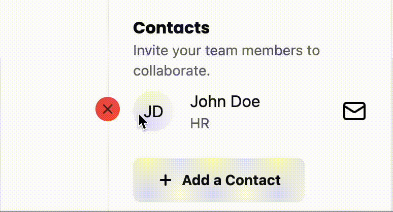
<h3 id="contact-label">Contacts</h3>
<p className="input-description">
  Invite your team members to collaborate.
</p>
<ul aria-labelledby="contact-label">
  {contacts.map((contact) => (
    <li key={contact.id}>
      <Avatar>
        <AvatarFallback>
          {contact.firstName.charAt(0)}
          {contact.lastName.charAt(0)}
        </AvatarFallback>
      </Avatar>
      <h4>
        {contact.firstName} {contact.lastName}
      </h4>
      <p>{contact.email}</p>
    </li>
  ))}
</ul>
<Sheet open={isContactSheetOpen} onOpenChange={setIsContactSheetOpen}>
  <SheetTrigger className="flex items-center gap-2 font-poppins text-sm font-bold bg-secondary py-3 px-6 rounded-md cursor-pointer">
Details
- We give the
<h3>anidso we can target it later. - We replaced the placeholder "Contact Card"
<div>with an<ul>that we'll use to populate our contacts- We give our
<ul>thearia-labelledbyattribute and target our<h3>. - Our contact card will be a
<li>.- We use the same
<Avatar>component that we used in theList.tsx - We add a
<h4>with the user name.- Using an
<h4>makes it easier for screen readers to skim the cards
- Using an
- And we add a
<p>tag with the email.
- We use the same
- We give our
With that, the test is now passing.
Refactor: style the contact card
Let's add styling to make the card look more like it does in the mocks.
<li key={contact.id} className="flex items-center gap-4 mb-6">
  <Avatar className="size-10">
    <AvatarFallback>
      {contact.firstName.charAt(0)}
      {contact.lastName.charAt(0)}
    </AvatarFallback>
  </Avatar>
  <div className="flex-1">
    <h4>
      {contact.firstName} {contact.lastName}
    </h4>
    <p className="text-sm text-zinc-500">{contact.role}</p>
  </div>
  <a
    aria-label={`Email to ${contact.email}`}
  >
    <Icon id="mail" size={24} />
  </a>
</li>
Details
- We added
flex items-center gap-4to align the avatar, name, and email icon vertically with16pxof space between elements and24pxof margin on the bottom. - A class of
size-10makes the avatar40pxwide and40pxtall. - The
flex-1class ensures that the name and role take up as much horizontal space as possible. text-sm font-mediumwill make the name14pxand have a font weight of medium.- The text role will be
14pxwithtext-smand gray withtext-zinc-500.- We replaced the email here with the role, because it seemed a bit redundant since we'd be adding a dedicated email button.
- We add and style the email, but we haven't added the functionality yet.
- It's very trivial to add the functionality, but we'll try and TDD this later.
Testing persisting Contacts in DB
We just need to add the contact text to our row assertion.
const newApplicationRow = page.getByRole("row", {
-  name: "December 15, 2025 Software Engineer Big Tech Co. 80000-120000",
+  name: "December 15, 2025 Software Engineer Big Tech Co. JD John Doe 80000-120000",
})
Implementing persisting Contacts in DB
Now that we have some state management for contacts, now we'll want to create the contacts in the DB. We'll start by refactoring the createApplication function to take in ContactFormData.
We'll first move the ContactFormData into functions.ts.
import { Contact, db } from "@/db/db"
import { z } from "zod"

export type ContactFormData = Omit<
  Contact,
  "createdAt" | "updatedAt" | "companyId"
> & {
  createdAt?: string
  updatedAt?: string
  companyId?: string
}
- import { createApplication } from "../pages/applications/functions"
+ import {
+   ContactFormData,
+   createApplication,
+ } from "../pages/applications/functions"
...
- import { Contact } from "@/db/db"
...
- type ContactFormData = Omit<
-   Contact,
-   "createdAt" | "updatedAt" | "companyId"
- > & {
-   createdAt?: string
-   updatedAt?: string
-   companyId?: string
- }
Details
- We're moving
ContactFormDatatofunctions.tsto maintain a clean import hierarchy. - This keeps our dependencies flowing in one direction:
db.ts>functions.ts>ApplicationForm.tsx. - Alternative: You could leave it in
ApplicationForm.tsxand import it intofunctions.ts, but this creates a circular import relationship that's harder to maintain.
Let's validate our contactsData with Zod.
const contactSchema = z.object({
  id: z.uuid(),
  firstName: z.string().min(1, "First name is required"),
  lastName: z.string().min(1, "Last name is required"),
  email: z.email({ message: "Invalid email address" }),
  role: z.string().min(1, "Role is required"),
  createdAt: z.string().optional(),
  updatedAt: z.string().optional(),
  companyId: z.string().optional(),
})

export const createApplication = async (
  formData: FormData,
  contactsData: ContactFormData[],
) => {
  ...
  const validatedContacts = z.array(contactSchema).parse(contactsData)
  ...
  if (validatedContacts.length > 0) {
    await db
      .insertInto("contacts")
      .values(
        validatedContacts.map((contact) => ({
          ...contact,
          companyId,
          createdAt: contact.createdAt ?? now,
          updatedAt: now,
        })),
      )
      .execute()
  }
  ...
Details
- We detail our Zod schema for a contact.
- Then to validate, we pass the schema into the
arraymethod and pass ourcontactsDatainto theparseto validate it.
- Then to validate, we pass the schema into the
- We pass the
contactsDatain as a second argument of thecreateApplication. - After validating, if the
validatedContactscontains at least a contact, then we add it to the DB.
Now we need to refactor our ApplicationForm action to pass the contacts to the createApplication.
const submitApplicationForm = async (formData: FormData) => {
  await createApplication(formData, contacts)
}

return (
  <form
    action={submitApplicationForm}
And with this, the test is passing and we have our happy path.
But we're not done. There's a bit more functionality we'll want to add.
Contact card Features
So there are a few more things we'd like the contact card to handle: email (which we partially implemented earlier) and the ability to remove a contact.
Testing Contact Email
Let's go back and make sure we document and test the email button.
First we'll add the selector for the button.
Now we'll add new describe and test case.
test.describe(
withDocMeta("Contact Card", {
description: "Details of a contact associated with a job application.",
}),
() => {
test("Contact Card Email button", async ({ page }, testInfo) => {
await test.step("When on the New Application page, ", async () => {
await page.goto("/applications/new")
})
await test.step("after you added a contact. The contact card displays.", async () => {
const addContactButton = page.getByRole(
...selectors.buttonAddContact,
)
await addContactButton.click()
await page.getByRole(...selectors.inputFirstName).fill("John")
await page.getByRole(...selectors.inputLastName).fill("Doe")
await page.getByRole(...selectors.inputRole).fill("HR Manager")
await page
.getByRole(...selectors.inputEmail)
await page.getByRole(...selectors.buttonCreateContact).click()
const contactCard = page.getByRole(
...selectors.headingTestingContact,
)
await expect(contactCard).toBeVisible()
})
await test.step("Clicking the Email button on the contact card should open your email client.", async () => {
const contactEmailButton = page.getByRole(
...selectors.buttonContactEmail,
)
await screenshot(testInfo, contactEmailButton, {
annotation: {
text: "Click the Email button to contact this person",
position: "left",
},
})
await expect(contactEmailButton).toHaveAttribute(
"href",
)
})
})
},
)
Details
We add a new describe block which will generate a separate page. We'll focus on describing all the contact card features here.
Our first test case will be to validate the email.
Implement Contact Email
Now to make it pass all we need to do is add the href to the link.
<a
  aria-label={`Email to ${contact.email}`}
  href={`mailto:${contact.email}`}
>
  <Icon id="mail" size={24} />
</a>
And now the test is passing!
Testing removing a contact
So what if someone wants to remove a contact? Let's write a test that clicks a button to remove a contact.
So a few things:
- The Figma mocks don't show a remove contact button. So we'll want to hide it until hovering over the card.
- Hiding elements actually isn't good for accessibility. So we'll still want to expose it in a way that screen readers can access it while hiding it contextually from normal users.
Let's add a selector for our remove button.
buttonRemoveContact: ["button", { name: "Remove John Doe" }],
Now we'll create our test case that shows the button when hovering or focused.
test("Remove a Contact", async ({ page }, testInfo) => {
await test.step("When on the New Application page, ", async () => {
await page.goto("/applications/new")
})
const contactCard = page.getByRole(...selectors.headingTestingContact)
await test.step("after you added a contact. The contact card displays.", async () => {
await page.getByRole(...selectors.buttonAddContact).click()
await page.getByRole(...selectors.inputFirstName).fill("John")
await page.getByRole(...selectors.inputLastName).fill("Doe")
await page.getByRole(...selectors.inputRole).fill("HR Manager")
await page
.getByRole(...selectors.inputEmail)
await page.getByRole(...selectors.buttonCreateContact).click()
await expect(contactCard).toBeVisible()
await screenshot(
testInfo,
page.getByRole(...selectors.listContacts),
{
annotation: {
text: "Contact card displayed in the Contacts section",
position: "left",
},
},
)
})
const removeButton = page.getByRole(...selectors.buttonRemoveContact)
await test.step("Hover over the contact card to reveal the Remove button.", async () => {
await expect(removeButton).toBeAttached()
await expect(removeButton).toHaveScreenshot(
"contact-remove-btn--initial.png",
)
await contactCard.hover()
await expect(removeButton).toHaveScreenshot(
"contact-remove-btn--hover-focus.png",
)
await screenshot(testInfo, removeButton, {
annotation: {
text: "Remove Contact button on hover of the contact card",
position: "left",
highlightFillStyle: "rgba(0, 0, 0, 0)",
},
})
// reset hover state of contact card by moving mouse somewhere else
await page.getByRole(...selectors.headerNewApplication).hover()
await expect(removeButton).toHaveScreenshot(
"contact-remove-btn--initial.png",
)
})
await test.step("Alternatively, focus on the Remove button to reveal it too.", async () => {
await expect(removeButton).toHaveScreenshot(
"contact-remove-btn--initial.png",
)
await removeButton.focus()
await expect(removeButton).toHaveScreenshot(
"contact-remove-btn--hover-focus.png",
)
await screenshot(testInfo, removeButton, {
annotation: {
text: "Remove Contact button on focus",
position: "left",
highlightFillStyle: "rgba(0, 0, 0, 0)",
},
})
await removeButton.blur()
await expect(removeButton).toHaveScreenshot(
"contact-remove-btn--initial.png",
)
})
await test.step("Click the Remove button to delete the contact from the application form.", async () => {
await removeButton.click()
await expect(removeButton).toBeHidden()
await expect(contactCard).toBeHidden()
})
})
Details
- We have 5 steps.
- Go to the page.
- Add a contact.
- Assert the button appears on hover.
- Assert that the button appears on focus.
- Clicking the button should remove the contact.
- There are a few caveats to the steps.
- If we hide or
display: nonethe button, it removes it from the accessibility tree, which is what we do not want. - Because of this limitation we also can use asserts like
toBeHiddenortoBeVisible. So the only thing we can do is assert that the button is at least attached to the DOM. - We'll need to rely on the screenshots to capture if the Remove button is visible or not.
- I strongly dislike using screenshots for assertions, because you can't TDD them. But since this is the only way we can be confident that we don't break this functionality in the future, I'm willing to use them to prevent regressions.
- We also use the same file to assert that the initial state is the same between renders.
- We use the same file for hover and focus as well, because we do want to make sure these render the same.
- If we hide or
Implementing removing a contact
First, we're going to implement a naive solution. We're only focused on making the test pass.
<li
  key={contact.id}
  className="relative flex items-center gap-4 mb-6"
>
  <button
    role="button"
    className="opacity-0 absolute top-2 -left-[37px] rounded-full bg-destructive p-1"
    aria-label={`Remove ${contact.firstName} ${contact.lastName}`}
    onClick={() => setContacts([])}
  >
    <Icon id="close" size={16} />
  </button>
  <Avatar className="size-10">
Details
- We add the class of
relativeto the<li>.- We need to do this to position the button relative to its container.
- We add our
<button>just before the<Avatar>component.- We use a normal
<button>JSX element instead of our shadcn/ui button because we want to avoid the default styling. - We style the button with
opacity-0to make the button not visible while also not removing it from the DOM. - We position the button with
absoluteto allow it to appear just off the side of the contact card.- The button default position is the corner of its parent, so we move it down from the top and back a bit to make it appear just off the side of the contact card with
top-2 -left-[37px]
- The button default position is the corner of its parent, so we move it down from the top and back a bit to make it appear just off the side of the contact card with
- We make the button circular with
rounded-full bg-destructivewill make the background red.p-1gives just a bit of padding around the button.- In order to target the button and to help with accessibility we give the button an
aria-labelthat is derived from the contact's information. - Lastly, we create a very naive solution to delete our contact with the onClick event.
- We'll expand our test case in a moment to make sure that this particular solution won't pass our test.
- When the button is visible, we show the user the close icon.
- We use a normal
With that our test is passing.
But as you might notice, our remove button is currently too aggressive and will remove all contacts. So to prevent this from being a possible regression later, let's extend our test to be a bit more specific.
We also need to fix the styling more to make it visible on hover or focus. But we'll handle that in a refactor step.
Remove one specific contact
To test this, let's add multiple contacts.
Let's add a few extra selectors.
headingTestingContact: ["heading", { name: "John Doe" }],
headingTestingContact2: ["heading", { name: "Jane Smith" }],
headingTestingContact3: ["heading", { name: "Joe Public" }],
buttonRemoveContact: ["button", { name: "Remove Jane Smith" }],
Details
- We add headings for 2 more contacts.
- We changed the remove button to Jane Smith.
- Testing the middle contact will give us confidence that we are able to remove a contact from the array without displacing items at the beginning or end of the array.
const contactCard1 = page.getByRole(
...selectors.headingTestingContact,
)
const contactCard2 = page.getByRole(
...selectors.headingTestingContact2,
)
const contactCard3 = page.getByRole(
...selectors.headingTestingContact3,
)
await test.step("after you added a contact. The contact card displays.", async () => {
const addContactButton = page.getByRole(
...selectors.buttonAddContact,
)
const firstNameInput = page.getByRole(...selectors.inputFirstName)
const lastNameInput = page.getByRole(...selectors.inputLastName)
const roleInput = page.getByRole(...selectors.inputRole)
const emailInput = page.getByRole(...selectors.inputEmail)
await addContactButton.click()
await firstNameInput.fill("John")
await lastNameInput.fill("Doe")
await roleInput.fill("HR Manager")
await addContactButton.click()
await firstNameInput.fill("Jane")
await lastNameInput.fill("Smith")
await roleInput.fill("CTO")
await addContactButton.click()
await firstNameInput.fill("Joe")
await lastNameInput.fill("Public")
await roleInput.fill("Eng Manager")
await expect(contactCard1).toBeVisible()
await expect(contactCard2).toBeVisible()
await expect(contactCard3).toBeVisible()
await screenshot(
testInfo,
page.getByRole(...selectors.listContacts),
{
annotation: {
text: "Contact card displayed in the Contacts section",
position: "left",
},
},
)
})
Details
We add our two new contacts and assert that all three appear on the page.
If we run the test now, it passes. But that's only because clicking any Remove Contact button removes them all. So we'll need to update our assertion to capture our intended functionality.
await test.step("Hover over the contact card to reveal the Remove button.", async () => {
  await expect(removeButton).toBeAttached()

  await expect(removeButton).toHaveScreenshot(
    "contact-remove-btn--initial.png",
  )
  await contactCard2.hover()
  await expect(removeButton).toHaveScreenshot(
    "contact-remove-btn--hover-focus.png",
  )
  await screenshot(testInfo, removeButton, {
    annotation: {
      text: "Remove Contact button on hover of the contact card",
      position: "left",
      highlightFillStyle: "rgba(0, 0, 0, 0)",
    },
  })
  // reset hover state of contact card by moving mouse somewhere else
  await page.getByRole(...selectors.headerNewApplication).hover()
  await expect(removeButton).toHaveScreenshot(
    "contact-remove-btn--initial.png",
  )
})
...
await test.step("Click the Remove button to delete the contact from the application form.", async () => {
  await removeButton.click()
  await expect(removeButton).toBeHidden()
  await expect(contactCard2).toBeHidden()

  await expect(contactCard1).toBeVisible()
  await expect(contactCard3).toBeVisible()
})
Details
- We hover over the second contact card (Jane Smith) to make its remove button visible.
- We verify that clicking the remove button removes only the second contact, leaving the first and third contacts still visible. Which confirms we're removing the correct item from the array.
Now our test is failing as expected.
Implement removing one specific contact
Now let's refactor the onClick event for our Remove Contact button.
<button
  role="button"
  className="opacity-0 absolute top-2 -left-[37px] rounded-full bg-destructive p-1"
  aria-label={`Remove ${contact.firstName} ${contact.lastName}`}
  onClick={() =>
    setContacts((contacts) =>
      contacts.filter(({ id }) => id !== contact.id),
    )
  }
>
Details
We use the filter method on the contacts to remove any contacts that match the current element's id.
And with that, the test is passing, and we're confident that we can remove a specific contact.
Refactor to actually show or hide the Remove Contact button
Let's add the tailwind classes to show the button on focus and when we hover over the contact card.
<li
  key={contact.id}
  className="relative group/card flex items-center gap-4 mb-6"
>
  <button
    role="button"
    className="opacity-0 group-hover/card:opacity-100 focus:opacity-100 absolute top-2 -left-[37px] rounded-full bg-destructive p-1"
    aria-label={`Remove ${contact.firstName} ${contact.lastName}`}
    onClick={() =>
      setContacts((contacts) =>
        contacts.filter(({ id }) => id !== contact.id),
      )
    }
  >
Details
- We add the
group/cardclass to the<li>.- This is a named group, which allows tailwind to generate more specific css to target this element and elements we want to style based off this element.
- We add 2 classes to our
<button>.group-hover/card:opacity-100: when we hover over a group with the name card, we set the opacity to 100.focus:opacity-100: when the element gains the focus event, it also will set the opacity to 100.- This has the bonus of showing the element when tabbing through content, and for announcing it to screen readers when focuses.
With that our tests are now failing!

This is one of the main reasons I dislike screenshot testing. Because you can't TDD it, as you work on the problem, the test will fail even if it is now working correctly. It's retroactive testing. But, sadly, since this is a styling test, there isn't a much better way to test this without testing implementation details, which has a number of other problems.
Anyway, all we need to do is update the screenshots.
Updating screenshot assert
There are 2 ways to update the screenshots. CLI and UI.
To update from the CLI you can run a command like
npx playwright test --update-snapshots --update-source-method=overwrite
Or add a new script to the package.json with the --update-snapshots flag added on to it.
But, since we've been using the Playwright UI, let's just update it using that. On the left sidebar of the UI, there is a Testing Options panel where you can change when the screenshots are updated.
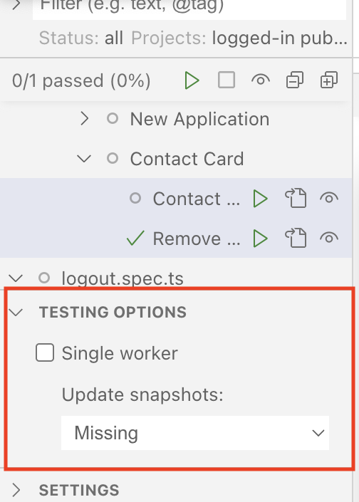
The UI by default only generated screenshots if they're missing. Change the dropdown to "Changed" and run the test again, and the screenshots will be updated.
Remember to swap it back to "Missing" so you don't accidentally overwrite the screenshots and make this assertions completely meaningless.
One last bug
There's a small problem if you test this out manually.
This is obviously not ideal. We'll fix this by adding a wrapper div and moving the positioning classes to that div and adding some padding so that the wrapper and the contact card have some space that over laps.
<div className="pr-5 absolute top-2 -left-[37px]">
  <button
    role="button"
    className="opacity-0 group-hover/card:opacity-100 focus:opacity-100 rounded-full bg-destructive p-1"
    aria-label={`Remove ${contact.firstName} ${contact.lastName}`}
    onClick={() =>
      setContacts((contacts) =>
        contacts.filter(({ id }) => id !== contact.id),
      )
    }
  >
    <Icon id="close" size={16} />
  </button>
</div>
Details
- We move the
absolute top-2 -left-[37px]classes on to the wrapper. - We give the wrapper
pr-5to give it20pxof right padding so that the wrapper will overlap with the contact card.
One of the downsides of styling bugs is that they're almost always impossible to test-drive. There are technically ways to do so, like checking a class is on an element. But this starts to tie testing to implementation details, which makes refactoring harder to do later. Luckily, this style bug doesn't prevent people from using our button, so it's not strictly required to have an automated test validate it's behavior.
The Sad Path
So, we've been TDDing the happy path. And it's been nice. We have a lot of confidence that when you enter all the input fields, that we create an application in the DB and display it to the user. But what happens if you forget one of the inputs? Or give an invalid input?
Currently, the app crashes and we get a vite error to display. Maybe not ideal behavior.
Let's implement better error validation.
So, what we'll do is implement a bit of error handling and make a toaster message appear. As the name kind of implies, a toaster is a simple notification that pops up (sometimes pops down or just appears) to display a notification to the user.
It has two parts—a Toaster and the Toast:
- The
Toasterhandles where the message is displayed. We can also cue up or show several messages at once. You can think of it like: theToaster"holds" theToast. - The
Toastertypically lives in a layout component. - Then, child components can send
Toastmessages to theToaster.
How to test a toaster
So, before we write the test, it's probably worthwhile to learn how to test and assert on a toast message.
If we go to the shadcn/ui docs for the sonner component. We can test and play with how the toaster works a bit.
If we inspect the element we see:

From the demo site, we can see that:
- We have a
<section>element that is populated with an<ol>- The section has a
aria-labelwhich will allow us to target it for our tests. - The
roleisregion. - The
aria-liveattribute is given, which makes this region live.- The
politevalue makes announcements wait for natural pauses in screen reader speech rather than interrupting immediately.
- The
- The section has a
Testing toast error messaging
Now that we have an understanding of what we're looking for, let's write our tests.
Let's start with our selectors.
regionToast: ["region", { name: "Notifications alt+T" }],
Now let's write a new test case with new describe block.
test.describe(
withDocMeta("Form Error Validation", {
description:
"Error messaging for validating for the New Application form.",
}),
() => {
test("New Application Form Validation Errors", async ({
page,
}, testInfo) => {
await test.step("When on the New Application page ", async () => {
await page.goto("/applications/new")
})
await test.step("and submit the New Application form with empty fields ", async () => {
const createButton = page.getByRole(...selectors.buttonCreate)
await createButton.click()
})
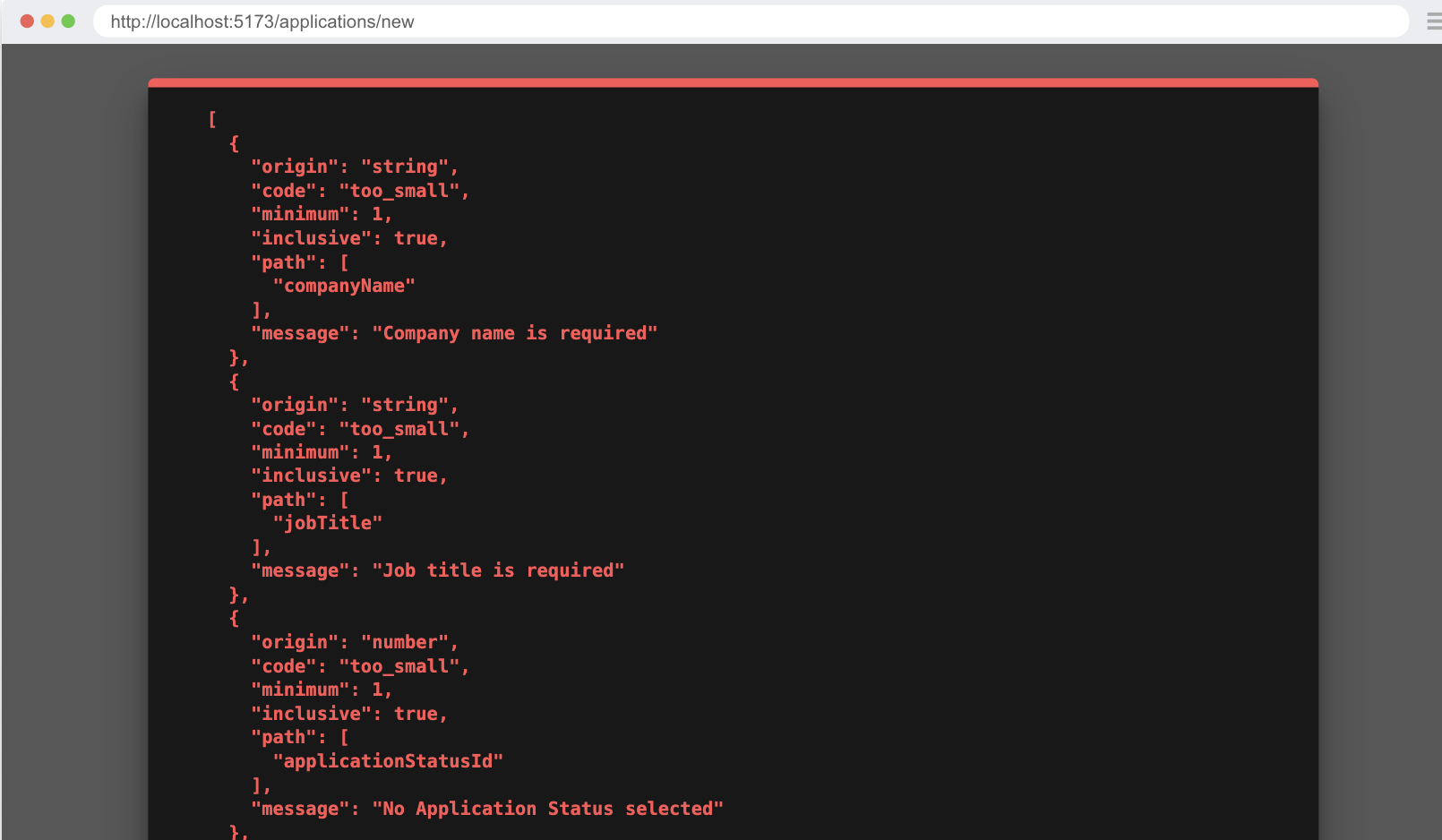
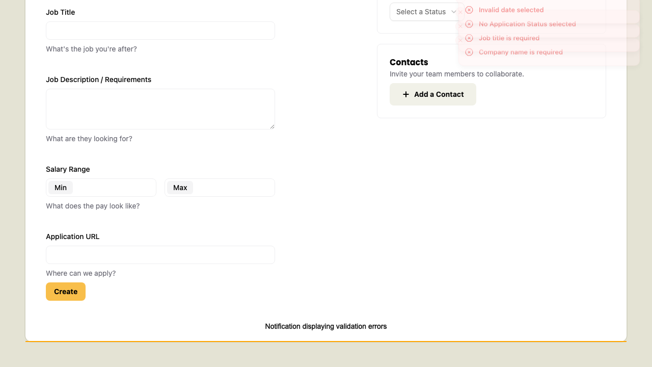
await test.step("it will display a notification with error messages for fields that don't pass validation.", async () => {
const toaster = page.getByRole(...selectors.regionToast)
await expect(toaster).toContainText(
"No Application Status selected",
)
await expect(toaster).toContainText("Invalid date selected")
await expect(toaster).toContainText("Job title is required")
await expect(toaster).toContainText("Company name is required")
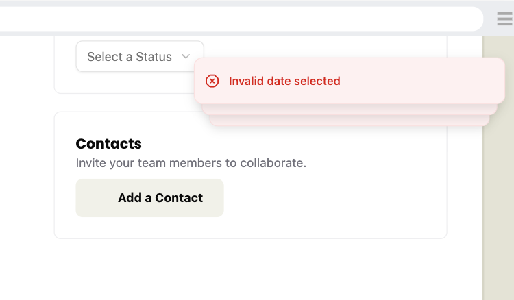
await screenshot(testInfo, toaster, {
annotation: {
text: "Notification displaying validation errors",
},
})
})
})
},
)
Details
- This could have been added to the "New Application" describe block, but that was getting long, so I gave it its own block/page instead.
- We're testing the 4 required fields in our Zod schema (from
functions.ts) to ensure their error messages display correctly.- Some validation logic (like Application Status IDs above 5) can't be triggered through the UI—these would require API-level tests, which are outside this tutorial's scope.
Implement toast error messaging
Within our InteriorLayout component, let's add the Toaster component:
import { type LayoutProps } from "rwsdk/router"
import { Header } from "@/app/components/Header"
import { Toaster } from "@/app/components/ui/sonner"

export const InteriorLayout = ({ children }: LayoutProps) => {
  return (
    <div className="page-wrapper">
      <div className="page bg-white">
        <Header />
        <div className="px-page-side">{children}</div>
        <Toaster position="top-right" richColors />
      </div>
    </div>
  )
}
Details
- We've imported the Toaster component at the top of our file.
- Then, we added the
Toastercomponent below the{children} - I positioned the
Toasterto the top right of the screen using thepositionprop and appliedrichColors
Now we'll need to send the error to the front end from our server function.
export const createApplication = async (
  formData: FormData,
  contactsData: ContactFormData[],
) => {
  const { request, ctx } = requestInfo

  try {
    const data = applicationFormSchema.parse({
      ...
    })
    ...
    const url = new URL(link("/applications"), request.url)
    return Response.redirect(url.href, 302)
  } catch (error) {
    if (error instanceof z.ZodError) {
      return { error: error.issues }
    }
    return { error: [{ message: String(error) }] }
  }
}
Details
- We wrap the code in a try block, and catch the errors to send to the front end.
- Apparently, we can't just throw an error without it causing problems in the front-end code. That's why we're building an error object to return.
- In the catch block, we check if this is a Zod error, and if it is, we pass the issues to the front end.
- We also add fallback error object in case something else goes wrong.
- Ideally, we'd avoid adding defensive code that we don't know how to test or trigger reliably. Code that can't be easily tested provides less confidence in its correctness, which makes it harder to maintain over time. That said, we do need a fallback error handler here to catch any unexpected failures that don't fit our known error patterns, ensuring the user at least gets a meaningful error message instead of a crash.
Next we'll rewrite the form action handler to use the new return error object.
import { toast } from "sonner"
...
const submitApplicationForm = async (formData: FormData) => {
  const res = await createApplication(formData, contacts)

  if ("error" in res) {
    res.error.forEach(({ message }) => toast.error(message))
  }
}
Details
- We import our toast message function at the top of the file.
- We get our response from the server function.
- We then check to see if the response has the key of
error. - If it does have the key of
errorwe loop over each element and pass themessageproperty to thetoast.errormethod.
- We then check to see if the response has the key of
Now running our tests. It passes and we see a toast message appear.
Refactor to make the toaster nicer
It's working, but there are a few problems.
- The toast messages overlap so you can only see the last one. (They expand on hover, but I think it'll be nice to see them all at once.)
- There are only three messages appearing, despite all the messages being in the DOM. There is no clear way to dismiss them other than waiting.
So let's customize our toaster just a bit by looking at the docs.
- To avoid the overlap we can add the
expandprop. - To increase the messages shown we can set
visibleToaststo4. - To have a close button we can add the
closeButtonprop.
<Toaster
  position="top-right"
  richColors
  expand
  visibleToasts={4}
  closeButton
/>

We don't need to actually make these changes as the default behavior is still accessible. But I just think this is nicer.
How to wait for animation
If you run the doc generation script, you might notice one oddity, depending on how fast your computer is.
The problem is that the notifications fade in and animate, and Playwright/test2doc doesn't know to wait for the elements to stop animating. Additionally, the annotation for this screenshot doesn't render.
Sadly, I don't have a great solution for this. So here is a pragmatic solution that's not ideal but works.
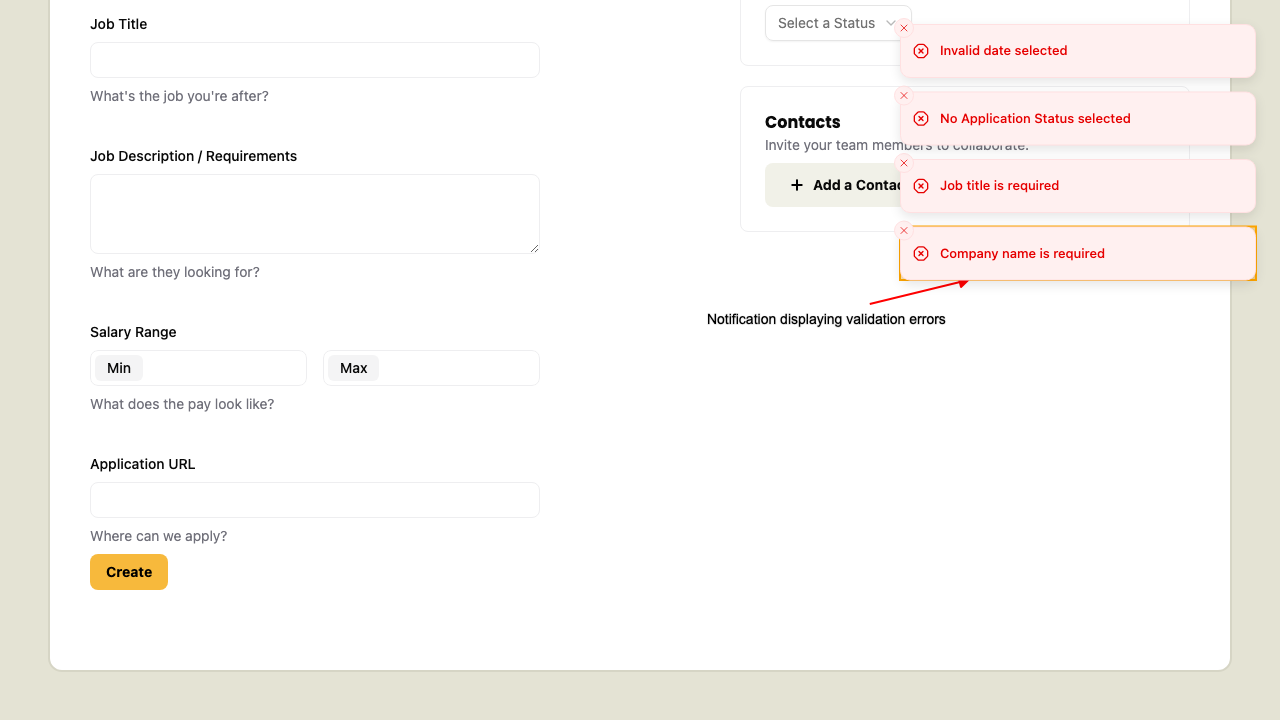
await test.step("it will display a notification with error messages for fields that don't pass validation.", async () => {
  const toaster = page.getByRole(...selectors.regionToast)

  await expect(toaster).toContainText(
    "No Application Status selected",
  )
  await expect(toaster).toContainText("Invalid date selected")
  await expect(toaster).toContainText("Job title is required")
  await expect(toaster).toContainText("Company name is required")

  const lastNotification = toaster.getByRole("listitem").nth(-1)
  await lastNotification.hover()
  await screenshot(testInfo, lastNotification, {
    annotation: {
      text: "Notification displaying validation errors",
    },
  })
})
Details
- Honestly, this feels a bit like testing implementation details.
- Arbitrarily targeting a child element because the parent element can't be captured feels a bit dirty.
- Since the "listitem" is scoped to the toaster, and is tightly coupled with the toaster, I don't think this selector needs to be in our
util.tsfile. - We grab the last element in the results with a
-1to thenthmethod. - Triggering the
hoverevent will force playwright to wait for the element to become stable.
This is not ideal, but it at least works. If you know a better solution please let me know.
With that we have our contacts added and form validating without crashing.
Code on GitHub
You can find the final code for this step on GitHub
Read More
- React: useState Hook
- React: Client Components
- MDN: aria-live
- Shadcn/ui: Sheet
- Shadcn/ui: Sonner (Toast)
- MDN: mailto links
- Playwright: Visual Comparisons
- Playwright: Auto-waiting
- Tailwind CSS: Group Hover
What's Coming Next?
Now that we've finished up the New Application page, we'll be moving on to viewing details on existing applications and updating their content.
Next lesson we'll:
- How to view details on existing Applications
- How to reuse the Application Form to edit an existing Application
- How to update applications in the DB